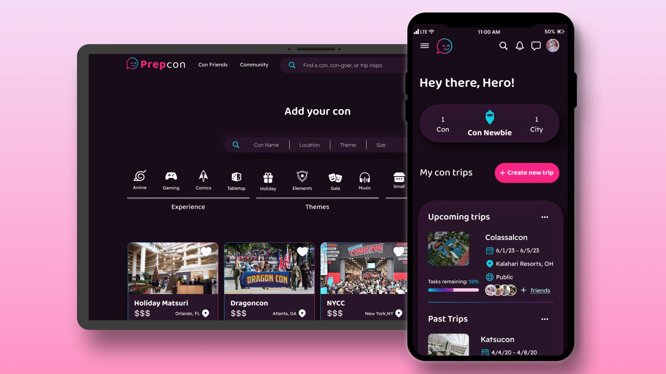
Providing Transparency and Control of YouTube Users’ Recommendations
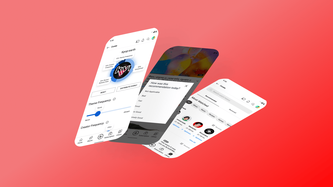
Preview of the final feature addition.
Product:
Mobile App Feature Addition
Timeline:
5 Weeks
Primary Tools:
Role: Solo Passion Project
UX/UI, Strategy, Research, Testing
Note: This passion project is not affiliated with YouTube and was carried out in the summer of 2023. YouTube features may have changed since the creation of this feature concept.
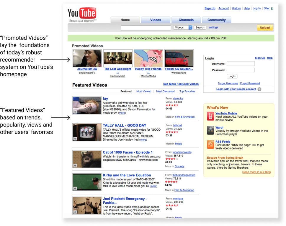
YouTube utilizes an advanced, AI-driven recommender system that began development in 2008.
YouTube, founded in 2005, is a video-sharing platform that dramatically changed how people share video content. It has a user-friendly interface with billions of users worldwide for entertainment, news, education, and community engagement.
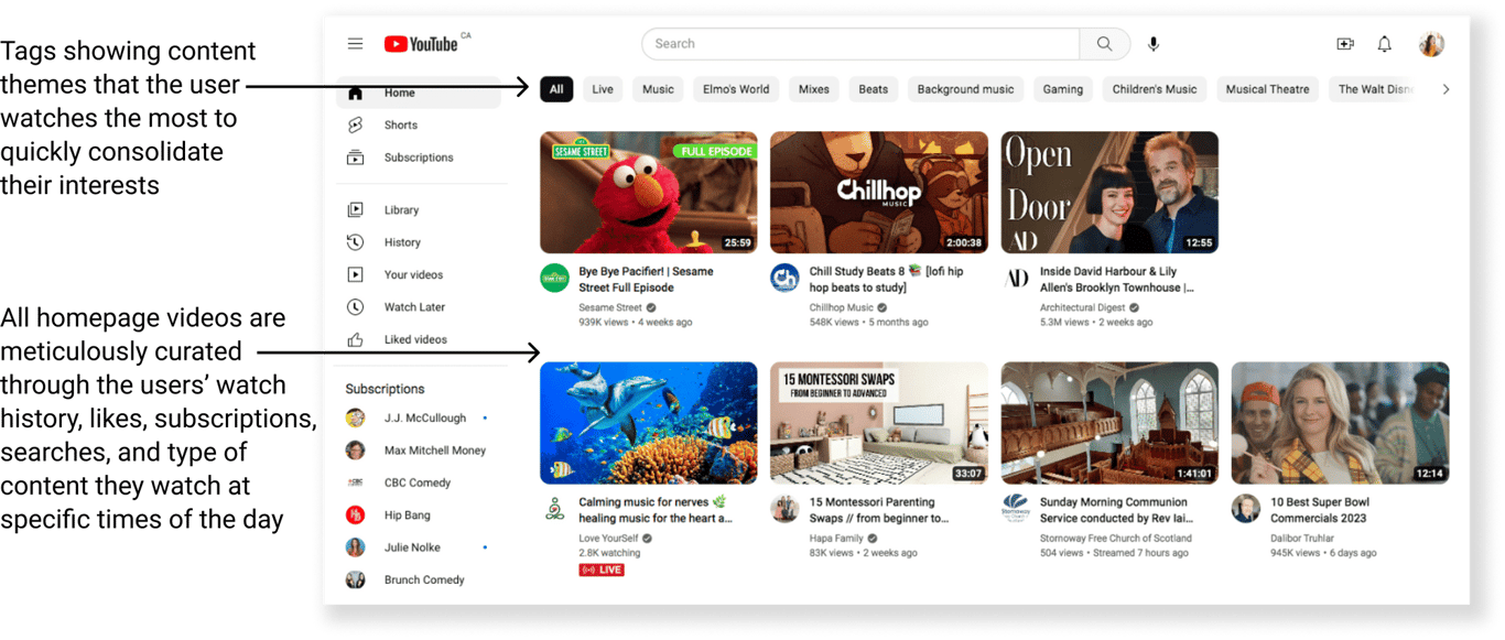
The system serves users with highly personalized content for every moment and occasion, down to the content they are likely to watch at specific times of the day. The recommender system allows users to have a more hands-off discovery experience.
The recommender system contributes to filter bubbles and is just plain frustrating at times.
YouTube's recommendation algorithm has been criticized for contributing to filter bubbles, misinformation, inappropriate content, and advertiser boycotts. Efforts have been made to address these issues, but finding the right balance remains a challenge.
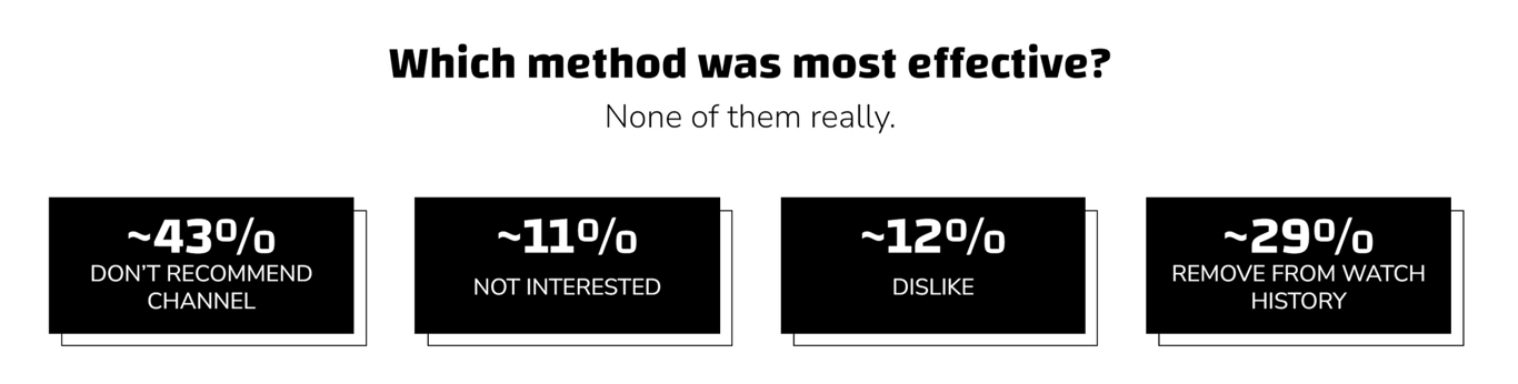
YouTube users can mark channels as "Don't Recommend" and adjust their Watch History or Playlist to improve recommendations. However, this can be time-consuming and confusing when multiple features affect the recommender system. In fact, Mozilla's research with 22,722 YouTube users found that the features YouTube claims to change the recommender system have little to no effect on users' algorithms.
Percentage of bad recommendations prevented per feature that YouTube claims will change a user’s recommendations. View study details at Mozilla.org.
The Solution:
Provide users with transparency of their recommendation history and the option to easily control their curated recommendations.
Understanding the Current Level of User Satisfaction with YouTube's Recommendation Algorithm
💡
Research Objectives:
Identify the most common types of content users consume on YouTube and how often they use the recommendation algorithm vs. searching.
Determine the main factors that influence user satisfaction with YouTube's recommendation algorithm, such as personalization, accuracy, and transparency.
Identify potential pain points with the current recommendation algorithm and explore potential solutions to improve the user experience.
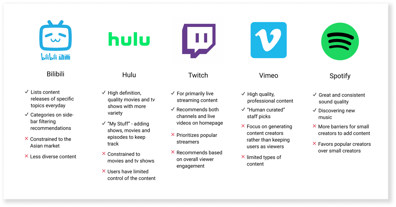
Secondary Research - Competitor Analysis
YouTube’s competitors that also utilize UI-driven recommender systems lean more toward discovery, accuracy, and customization for the user compared to YouTube.
Competitor Analysis pros and cons.
Primary Research - User Interviews
Hearing Recommendation Experiences from Users
🗨️ How often do you use recommendations vs. searching? Why do you use one or the other more?
“I use the recommendations more because it’s a heavy chore to think about what to watch.”
- Wenjin
“YouTube is more mindless for me, I don't necessarily know what I want to watch so I always go to recommendations.”
- Andy
“If I search for something, it’s because I really want to learn something.”
- Yebin
🗨️ How do you feel about the accuracy of YouTube's recommendations?
“40% of the time my recs are good, but 60% of the time I keep refreshing for something else.”
- Wenjin
“I’d say 80% of them are relevant while the rest may not cater to my mood at that time.”
- Yebin
“The general themes make sense, but the channels, not so much.”
- Andy
🗨️Have you ever encountered any problems or frustrations with YouTube's recommendations?
“I hate that I look up one thing once, and I’m suddenly recommended those videos.”
- Megan
“This content creator I love keeps getting pushed down my list, I get frustrated that it hides a lot from me.”
- Taylor
“If I click on something eventually I’m going to go in a circle and YouTube won’t show me anything new.”
Synthesizing these responses through affinity mapping revealed four key themes shared by all participants:
Key Theme #1: Passive Exploration
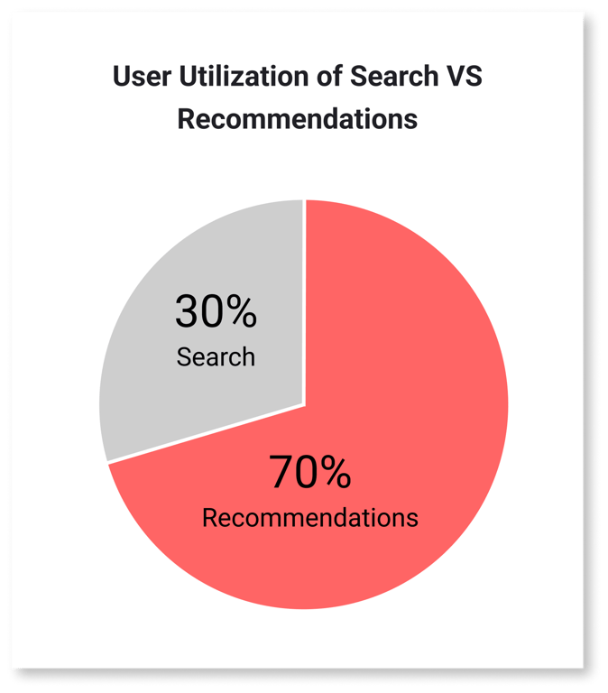
On average, users use recommendations 70% of the time while they use search 30% of the time.
Circle chart representing quantitative user interview results.
Key Theme #2: Recycled Content Recommendations
All participantshad frustrations with YouTube’s recommendations, primarily feeling their recommendations become too specific and pigeonhole them into an infinite cycle of the same content.
Key Theme #3: Algorithm Favoring Recent Activity over Past Activity
80% of participants feel that past interests get buried in the algorithm while recent interests are heavily recommended to them.
Key Theme #4: Algorithm Favoring General Themes Over Specific Channels
80% of participants feel that the general content themes of their recommendations are accurate, but they often struggle to find specific channels and current subscriptions.
I synthesized affinity map findings into two distinct behavioral archetypes. In this context, behavioral archetypes are more appropriate than personas, as consolidating personas would be difficult and less accurate due to YouTube's vast number of users. Instead, focusing on big-picture behaviors provides a clearer understanding of user behavior.
Archetype 1: The Leisurely Explorer
📢
Scenario
This person is taking a 15-minute break from studying and is looking to unwind with music videos from their favorite K-pop groups.
🏆
Goals
Easily and quickly find a music video on their home page
Discover a newly released video from their favorite group or a song they have not heard yet.
💢
Pain Points
The need to refresh recommendations
Recycled the same type of content from recent music videos
Don’t always want to see music videos they’ve watched
Archetype 2: The Purpose Driver
📢
Scenario
This person is looking for a specific video of a live show from their favorite K-pop group that was performed a year ago.
🏆
Goals
Find a high-quality version from the groups’ channel
Easily and quickly find the live show via search
💢
Pain Points
Being unable to find the specific show they need easily and quickly
Having a one-off niche search be recommended to them
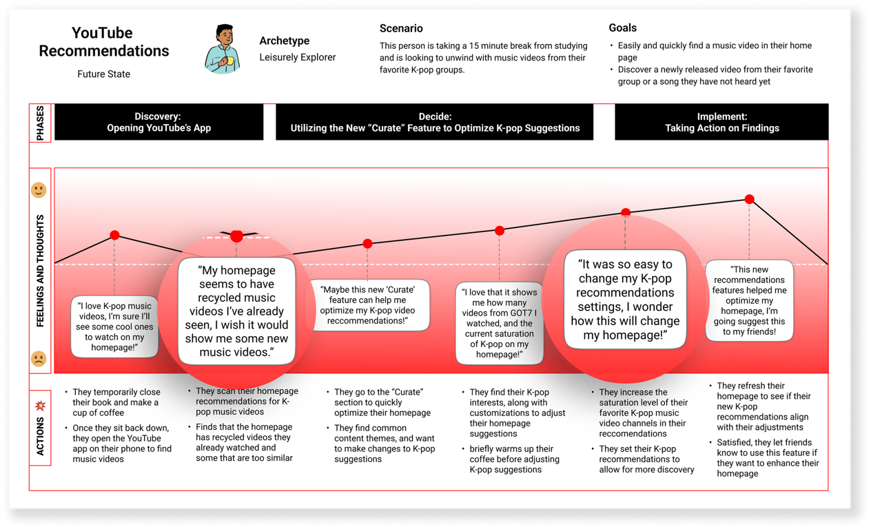
User Journey Map - The Future of YouTube Recommendations
To define the potential of this new feature, I asked “How might leisurely exploring users feel about controlling their recommendations?” and created a future state journey map to solidify the thoughts and outcomes based on users’ thoughts, feelings, and goals from interviewing.
Future state Journey Map.
How Might We best expand YouTube users’ recommendations to show them their diverse interests?
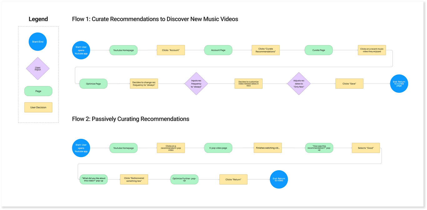
Demonstrating Recommendation Curation Through Task Flows
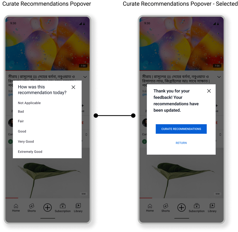
Keeping the leisurely explorer in mind, the most important task flows would demonstrate user actions when modifying recommendations. Additionally, there are more passive aspects of the feature, such as occasional pop-ups asking users about their experience with the video they just watched, in order to optimize their recommendations without requiring any hands-on input.
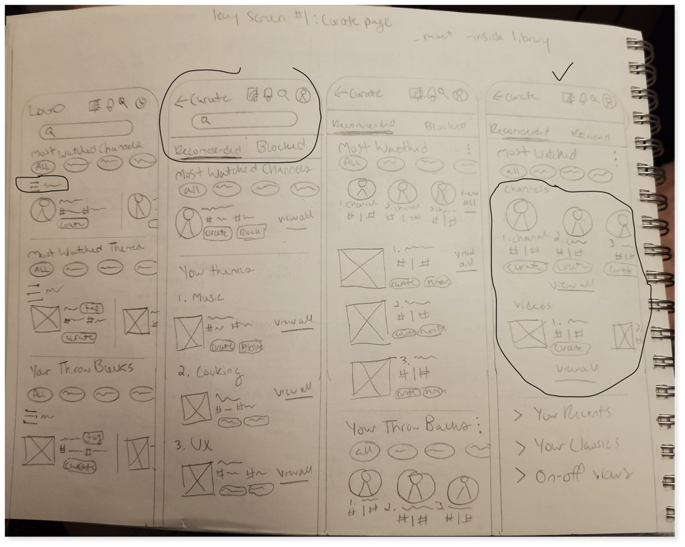
Balancing New UI Patterns with YouTube’s Design System in Low-Fidelity to Mid-Fidelity
One challenge encountered during ideation was how to integrate statistical patterns and user inputs that would be easy to understand and modify for casual users while remaining consistent with YouTube's design system. To address this, I brainstormed several low-fidelity solutions while examining YouTube's creator metrics and UI patterns within the fitness, finance, and news industries for recommendations and statistical patterns.
Low-Fidelity sketches of Curate Recommendations page.
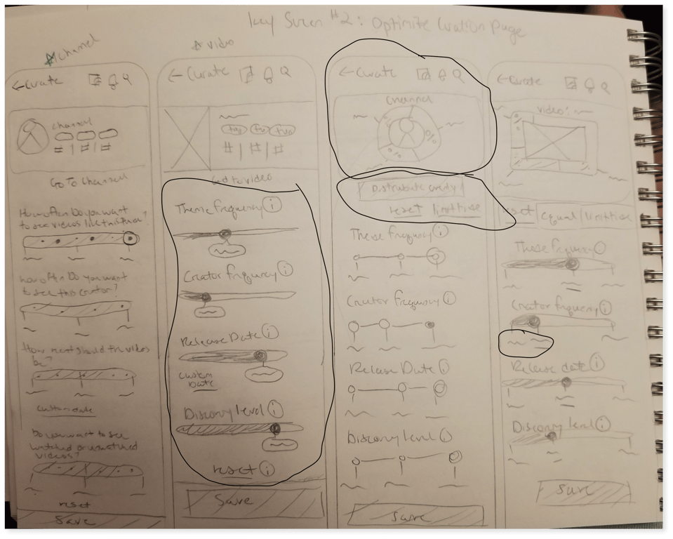
Low-Fidelity sketches of Recommendation Optimizing page.
Mid-Fidelity
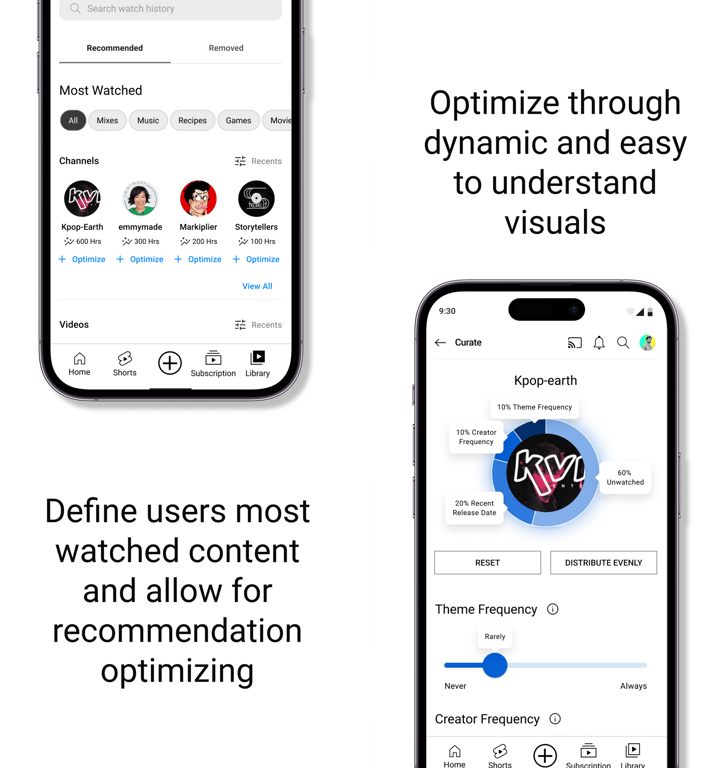
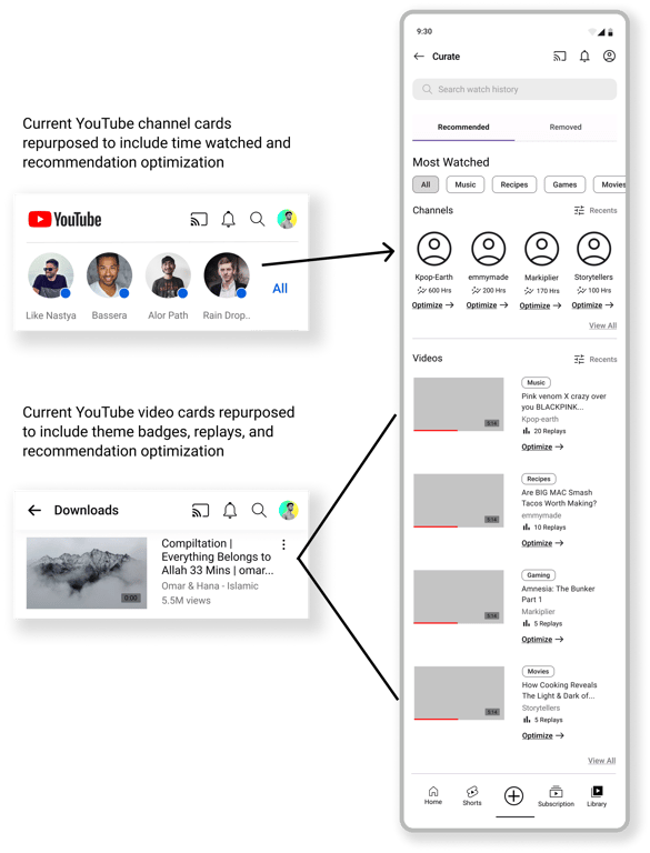
I made sure to reuse familiar patterns within the YouTube app, such as cards and tags, while also defining new elements that users can easily identify, such as videos and channels they've watched the most. Additionally, I included new affordances for curation to enhance the user experience.
Comparing current YouTube patterns with Mid-Fidelity ideation.
8 participants, unmoderated, conducted through Maze
Usability Test Questions:
Will users be able to easily find the new recommendations feature?
Will users have any trouble understanding the verbiage within the recommendation adjustments?
Is this new feature easy to use?
Goal Metrics 🏆
Users recover from 2 or fewer errors
6 out of 8 users successfully completed the tasks
Users each had 3 or fewer misclicks
Satisfaction scale of 4 or more for findability
Satisfaction scale of 4 or more for verbiage comprehension
Satisfaction scale of at least 4 or higher for overall usability
Key Results 📝
All users experienced no errors ✅
all users completed task flow 1 while all but 1 user completed task flow 2 ✅
Users misclicked an average of 5 times during task flow 1 ❗
Users rated findability an average of 2.6, with 5 out of 8 expecting the feature to be in the account settings or somewhere along the top navigation ❗
Users rated verbiage comprehension an average of 4, all users found the verbiage clear and easy to understand ✅
6 out of 8 users rated the overall usability as 4 or higher ✅
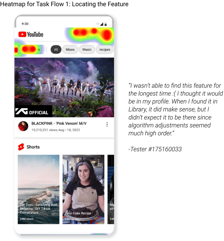
Heatmaps indicate that 5 out of 8 users had trouble finding the "Curate Recommendations" feature. Most users attempted to click on "Account" instead of finding it in the "Library" section.
Improving Findability and User Confidence with Affordances 💡
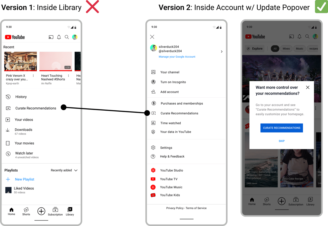
Improvement #1: Clarifying Feature Location
Since 7 out of 8 users attempted to find the Curate Recommendations feature on the top navigation and inside “Account”, it seemed to best fit the user’s mental models to move the feature from “Library” to “Account” between related features. To further ensure findability, I added a popover to inform the user of the feature upon their first time opening the app since updating.
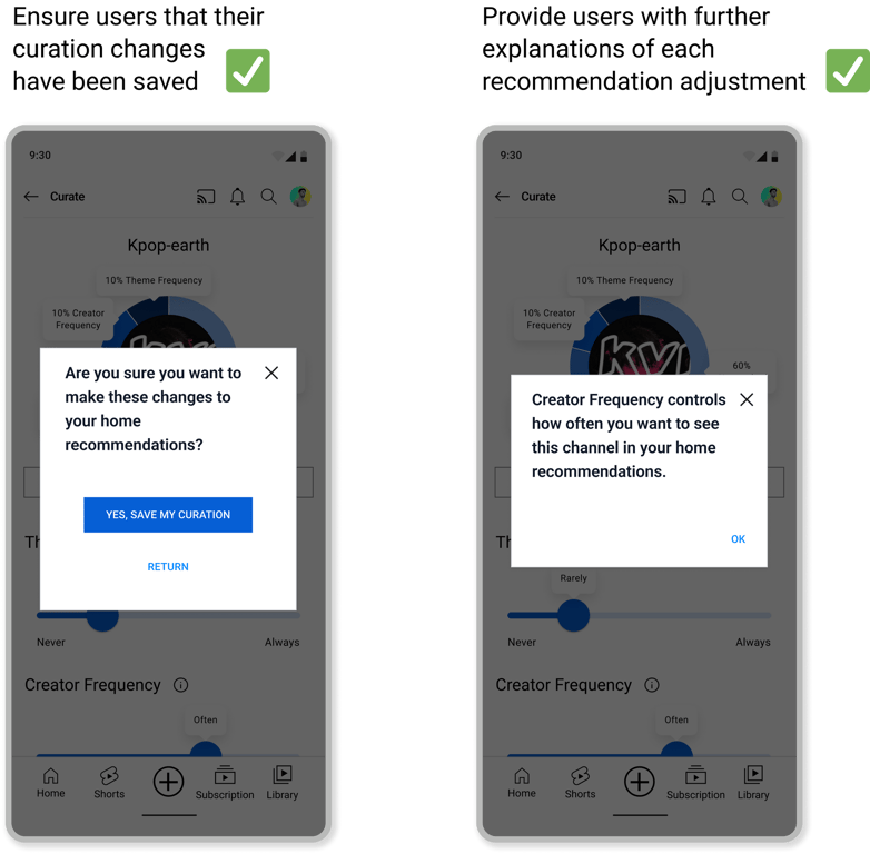
Improvement #2: Affordances to Ensure User Confidence
Based on heatmap observations and user comments, 6 out of 8 users seemed to either misclick excessively or were uncertain about how each optimization adjustment would affect their recommendations.
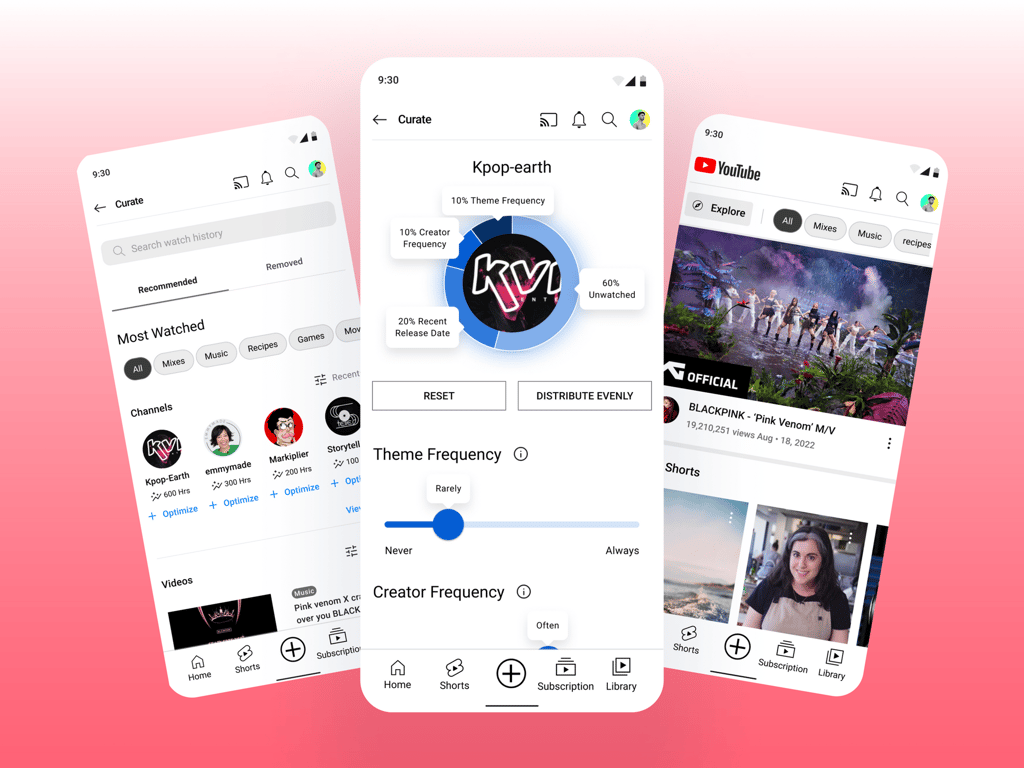
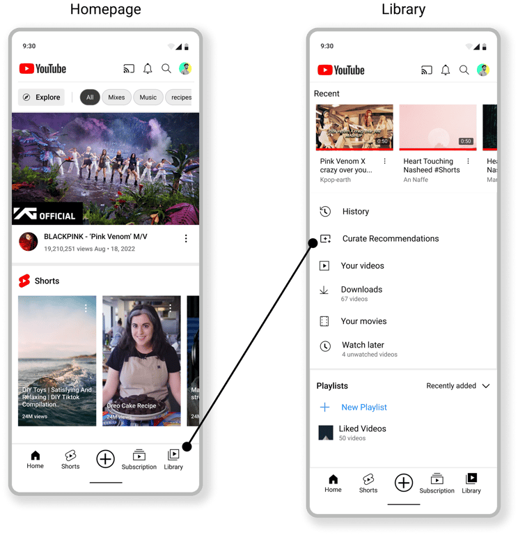
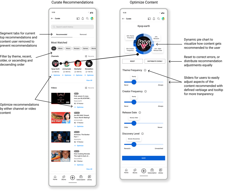
Final Prototype
Curate Recommendations on the YouTube App - Easily update themes, channels, frequency, and release date of your favorite content at anytime.
Easy hands-on optimization for curious users (left)
What I learned from the Curate YouTube Recommendations Feature Addition:
1. A feature may not appeal to every user.
Since YouTube has billions of users worldwide,every user interacts with it differently. After working through this platform with many user behavioral archetypes, I learned the importance of iterating early and how specific research goals need to be to satisfy that particular user group. Without the time constraints, a provisional survey would have been beneficial to gather patterns to then dig deeper into specific questions during user interviews.
2. Not every UX endeavor needs to fix a glaring problem, UX can also make something great even better.
There is a reason why YouTube is a top entertainment product in the world - Google leads in exceptional user experience and implemented the powerful recommender algorithm system that most YouTube users trust and enjoy. I am thrilled with the challenge that not all UX improvements need to fix a big, glaring problem, but can also make great features continuously better as time inevitably changes how users want to interact with digital products.
The “Curate Recomendation” Feature: Next Steps and the Future🔄:
2 out of 8 users expressed a bit of confusion and overwhelm with the number of adjustments they could make to the content they chose. In the project’s second phase, exploring ways to simplify this for users even further and user testing the simplified concept would be beneficial in seeing if more user archetypes would utilize this feature.
2. Retest location change of the feature.
Since finding the feature is very important, I would like to retest to unsure the new location aligns with most users’ mental models.


 Made with Bullet